

Elementor sticky column is one of the things that you might want to have on the Elementor website. Most of the people are using the home page made with Elementor, right? We bet you are too. If that’s the case, you are at the right place. In this post, we will see how you can make a sticky column with Elementor. The guide will cover a step-by-step guide on how you can use it. We will also see where you can use it and see its real application. So, let’s get started and see the basics of the sticky column.
What is Elementor sticky column?
We will begin with the basic question that most people have in their minds. Many people have no idea about what a sticky column is. So, we will start with the same.
Elementor sticky column is a column that becomes sticky. Let’s say, you have three widgets in the column. The first one can be the banner, the second one can be the email opt-in, and the last one can be the recent comments.
So, when we set the Elementor sticky column, the column will be stuck in this same place. When the user comes into the website, they will see the homepage and then the column. Now, usually, when the user will scroll down, the column will also be scrolled down. That won’t happen if the column will be sticky.
Therefore, the column will be there at the same place.
Now, people always have some questions – what happens to the widgets that are below the screen? If the column is sticky, the user will only be able to see the widgets that are on the screen. So, you need to ensure that the column has a limited amount of widgets.
We will now move on to the tutorial on how to do it.
How to Set Elementor sticky column?
We will now begin the guide and see how you can do it. There is one default way that most people will use. This is one of the worst ways you can set the Elementor sticky column. We will also see the reason for the same.
The default way to set the Sticky Column
Now, we will see the exact way on how to set the Elementor sticky column.
Usually, you would click on the column which you want to be sticky. You will then see the side panel where you can make the changes. This is where you will do the procedure.
One can simply head over to the advanced panel. In the advanced panel, there will be an option called Motion effects. For the people who don’t know, the Motion effects in the section where you can set the column’s position and set the effects too.
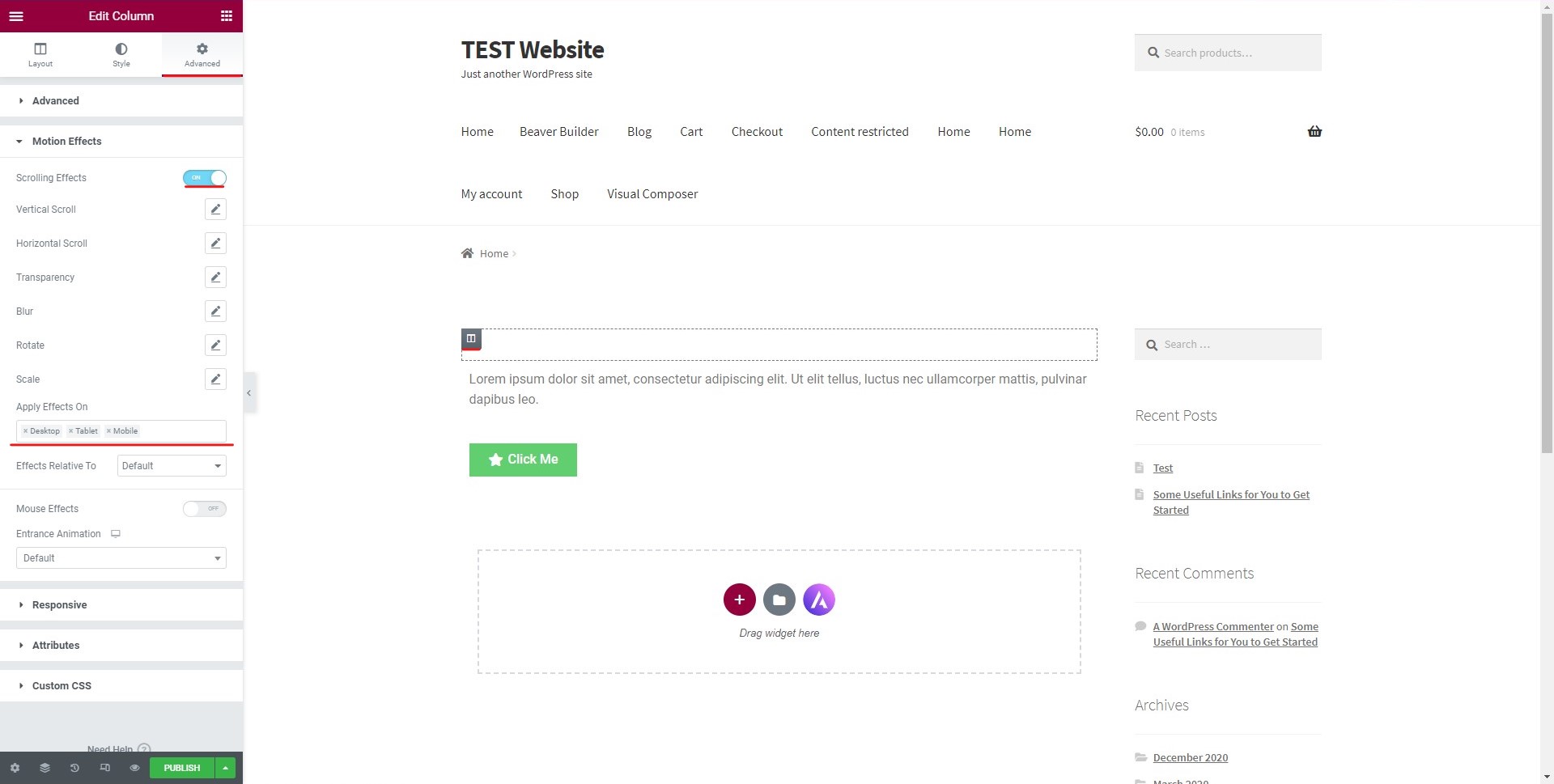
When you click on it, there will be an option for making it sticky. You can simply toggle it on and your job is almost done. However, things aren’t this easy.
Many people will do the same procedure and think that the job is done. No doubt, it will surely make the column sticky but few disadvantages come with it. We will see the same in the next section.
Why not use the default way?
The default way is the easy way to do it. There is no secret here. However, there are some of the basic things that you need to keep in mind here.
When you use the default way to make the column sticky, it will only invite trouble. In most of the themes, the only thing that is going to be sticky are the elements not the column.
So, when you check the website and scroll down the page, you will see that the element inside the column isn’t properly stuck there. It will come out and you will only see the column. This is the major issue that you will find. We will see the exact way to fix it too.
For that, you will have to go with the custom CSS. Custom CSS is a great option that you will find the Elementor. It will allow you to set a lot of things.
So, we will use the same way to see the Elementor sticky column. This will ensure that the elements or we can say the content on the column will stay on the column even when the user will scroll to the bottom.
Now that you know why you should use the custom CSS way to set the sticky column, we will begin the steps to do the same.
Custom CSS to make the Column Sticky
Don’t worry, you don’t need to know CSS to do this. You can do it in easy steps. We will see the exact way on how you can make the column sticky. For that, we will have to begin with the basic step.
The basic step is where we will select the column which you want to make sticky. You can select the column and you will see the left panel from where you can make all the changes.
Until now, it’s the same procedure that we did in the default way. Now, this is where the changes will start. We will make the changes now that are different,
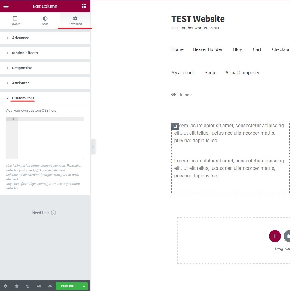
In the advanced tab of the panel, you will see an option called “Custom CSS”. There will be space for the same. This is where you can add the custom CSS.
Here is the code that you need to add there.
selector { position: sticky; position: -webkit-sticky; top: 50px; }
When you add the above-given code, it will make the column sticky.
The explanation is simple. The selector will select the entire column. The next code that is –WebKit-sticky is where you have made the entire column sticky. This will ensure that the content and column stay static and both of them stay at the same place when user scrolls to the bottom.
The last is the effect. When the user will scroll to 50 px, the sticky header will start.
Now that you know about the code, you can also make the changes here and customize it as per your need.
This was just the basic idea on how to set the Elementor Sticky column. Now, we will see the advanced tricks.
Advanced Code
Now, we will see a bit of advanced code on how you can make different changes. The biggest change that you might want to make is limiting the devices.
You might want to limit the number of devices where you can see the column.
Let’s see an example here. You might want to show the sticky column to the users who are on the desktop but if you show the sticky column for the people who are on mobile phones, it will be harder for them to read the content. Therefore, in this case, you might have to look for the other way and hide the sticky column for them.
Luckily, with few customizations, you can make the changes that will make the visibility a bit more controlled. In simpler words, you can set the devices where the user will be able to see the Elementor sticky column.
We will see the entire thing here. Here is the CSS code that you need to paste into the custom CSS part.
.body selector, .body selector {
position: sticky; position: -webkit-sticky; top: 50px;
}
Most people will have got the basic idea here. The code will only allow the sticky column to be visible for the desktop and the tablet. Hence, if the user visits the website from a mobile phone, they will not see the same sticky column. Instead, they will see the regular column.
You can make the changes in the code and use it as per your choice. In the end, the main aim is to ensure that you are giving the best experience to the users.
Applications of Elementor Sticky Column
Now, if you are thinking about where you can use it, you are at the right place. We will now see where you can use the sticky column.
There are many ways where you can use the sticky column, here are some of the best usage.
Advertise: You can use it for the advertisement. You can set a banner where you might be promoting a discount or it can be a banner for the third party ad. You can show it as a sticky column. This will ensure the user will see the advertisement fully before they proceed and read the entire content. If the column is highlighting the banner, it will surely invite more people to click on the link.
Description: Another great way that people use it for a subscription. You can use it to collect the email addresses of the people who follow you. When people enter their email addresses, you can collect the same thing via email. In this way, you can grow your email list and get more people to sign up for the newsletter. This is a great way to increase the list size.
Empty Space: Many people simply use it because they don’t want to show the space after the content gets over. Usually, the column won’t have more things to show. So, when the column’s sections get over, it will just be an empty column. This will feel like something is missing. If the content is on the left side and the column is empty, it doesn’t look good. Hence, one can use the sticky column here.
Depending on your website, you might want to use it for other things too.
Tips on using Elementor Sticky Column
Now, we will see some of the tips for using the sticky column. You can follow all the tips to use it more effectively. These are the tips that you can follow.
Number of Elements: Always make sure that you are using a limited number of elements in the column. If there are more elements, you will end up with a messed-up column. Hence, the number should be limited which fits on the screen.
Devices: You can surely disable the sticky column for mobile devices. When the users are checking your website from a small screen, the sticky column might turn out to be irritating in that case. So, you can surely disable it for the smaller screen.
Attractive: You can always make sure that the elements that you show in the column are attractive. If you don’t show them attractive or interesting elements, they won’t like the sticky column. So, if you are putting up a banner, make sure the design is great.
Content: You also have to ensure that the sticky column doesn’t end up blocking the content. The content should be visible from all the devices. So, check your content first and then you can think about adding the sticky column.
Important things first: Sequence is yet another interesting thing to focus on here. You should make sure that the column is in the right sequence. If there is a newsletter and recent comments section in the column, the newsletter should be at first.
Testing: Once you set all the things, test the website from a different device to see if everything is working fine and if all the content on the website is visible or not.
Final Words
To conclude, this is how you can add the sticky column in Elementor. You can surely follow the tips given below along with the tutorial. Also, if you are making changes in the Elementor CSS, you should check the code properly before you publish it. Therefore, we have mentioned that the testing of the website is extremely important. If you want to play around with CSS, you can copy the current CSS and save it somewhere. Thereafter, you can make the changes and if the changes are not good, you can revert to the original one. This is the reason why you should save it.